Our New Website Is Live: A Fresh Look, Built In-House

Our new website is live, and we could not be more excited to show it off.
We design and build websites for a living, so our own site has to earn its keep too. We rebuilt it from the ground up: a fresh design, cleaner navigation, and a much clearer way to see exactly what we do and what it costs. Here is a look at what changed, and the thinking behind it.
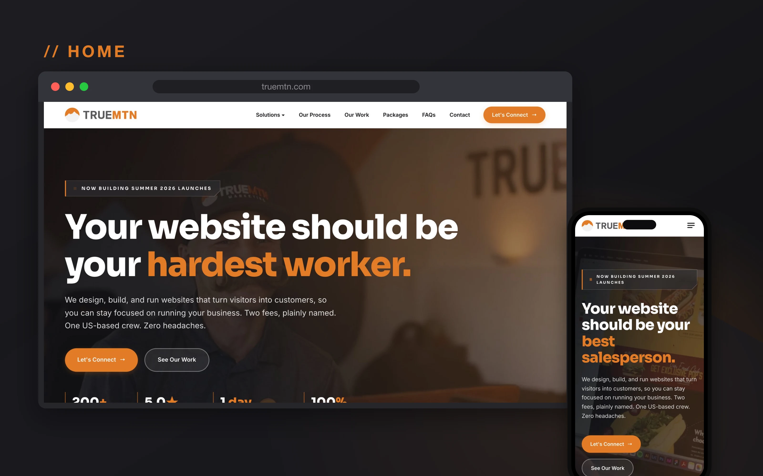
A look at the new site
The design story
We did not want a site that looks like every other agency. We wanted ours to feel like us: confident, plainspoken, and a little gritty, with craft in every detail.
So the whole thing is built on the True Mtn look. The warm orange, the clipped corners instead of soft pills, the mountain silhouettes, and clean Sora and Inter type. Every screen is designed to feel like us and then get out of the way, so the message comes through and the next step is always obvious. It is the same design sensibility we bring to client work, pointed at our own front door.
What’s new
Tailored, Never Templated
Every page is designed around the business and built on our own wireframes. No bought theme, no cookie-cutter layout.
Built for Every Screen
Designed phone-first, so it looks sharp whether someone finds you on a laptop or on a lunch break.
Easy to Navigate
Clear menus and a structure that helps people find what they need fast.
Packages You Can Actually Read
The new pricing laid out plainly, so you can see what each plan includes at a glance.
A Real Resource Blog
Honest, useful articles for business owners, not keyword filler.
Easy to Reach Us
Clear calls to action and a simple contact form, never more than a click away.
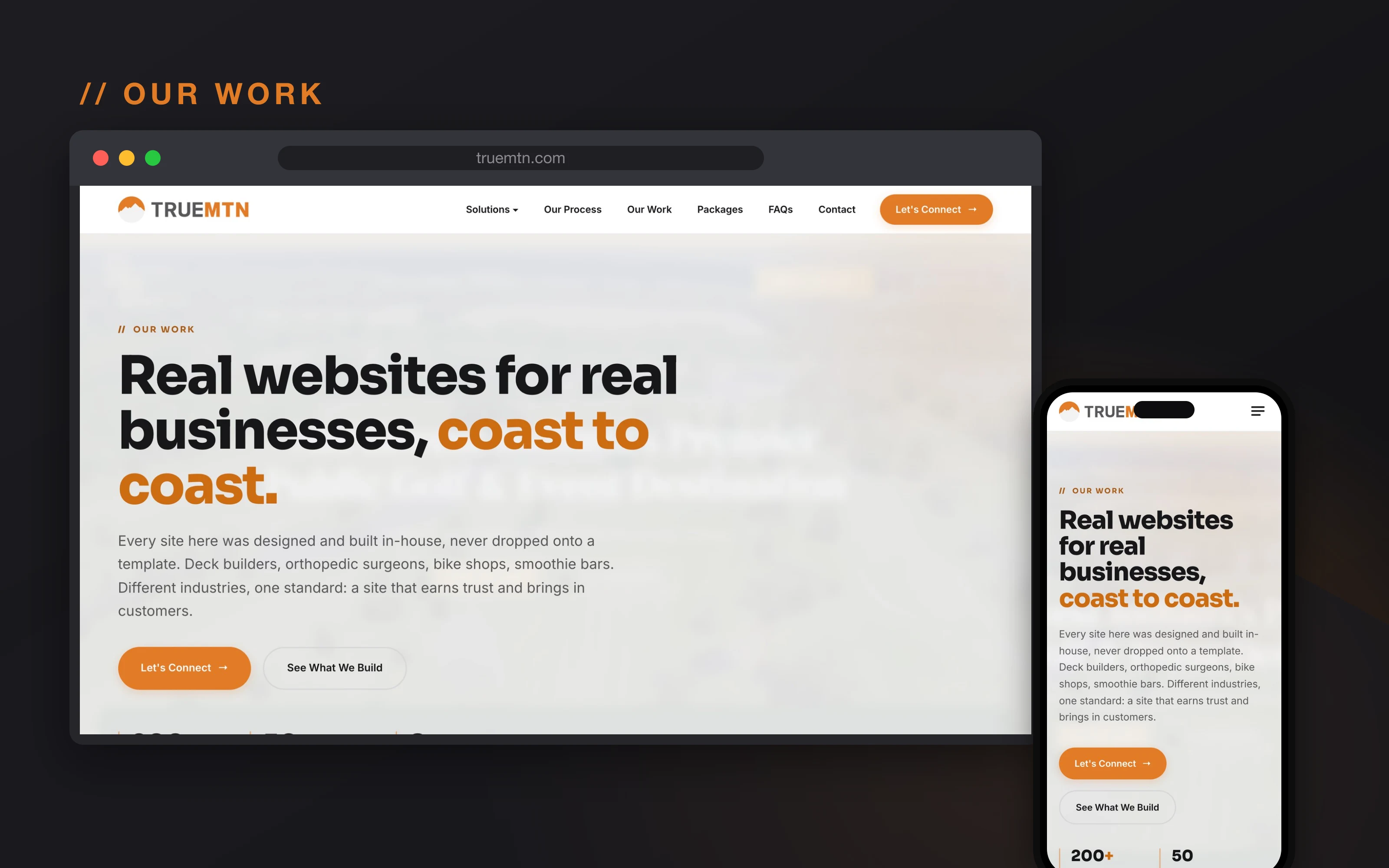
Built to show our range
We work with all kinds of businesses, from deck builders to orthopedic surgeons, so the new Our Work section had to show that range. Every project there was designed and built in-house, tailored to that business, never dropped onto a template.
Depth where it counts
The interior pages got just as much attention as the homepage. Each solutions page is designed to answer real questions, lay out what is included, and make the next step obvious. No filler, no dead ends.
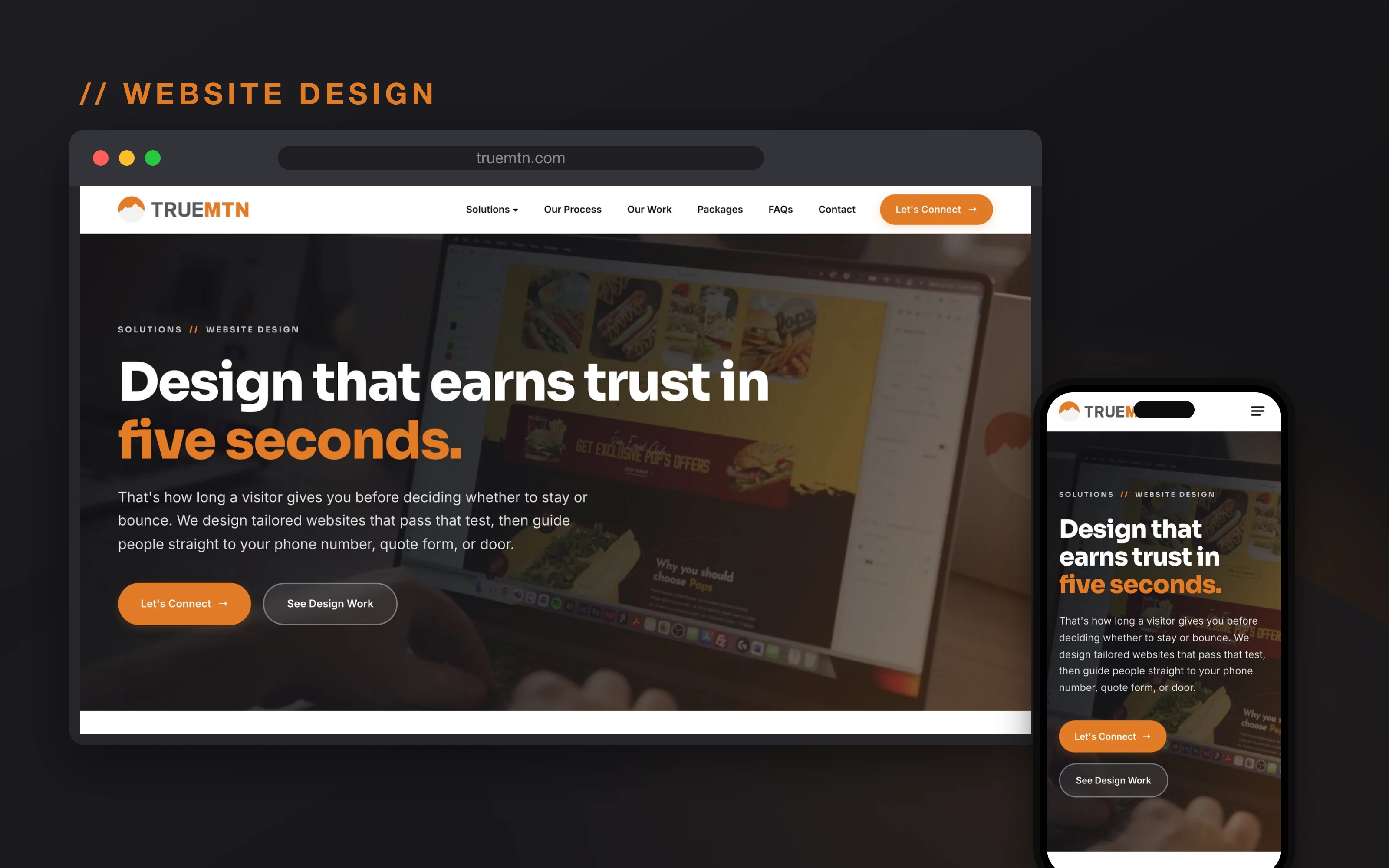
Designed for every screen
Look closely at any of these and you will see the same page on a phone right next to it. That is on purpose. Most people will find you on a phone, so we design phone-first and make sure every layout holds up on a small screen before we call it done.
Clearer packages and pricing
The biggest change is how we present our packages. We rebuilt the model around two fees, plainly named, and the new pricing page lays it all out: what each plan includes, what it costs, and why. No mystery, no pressure.
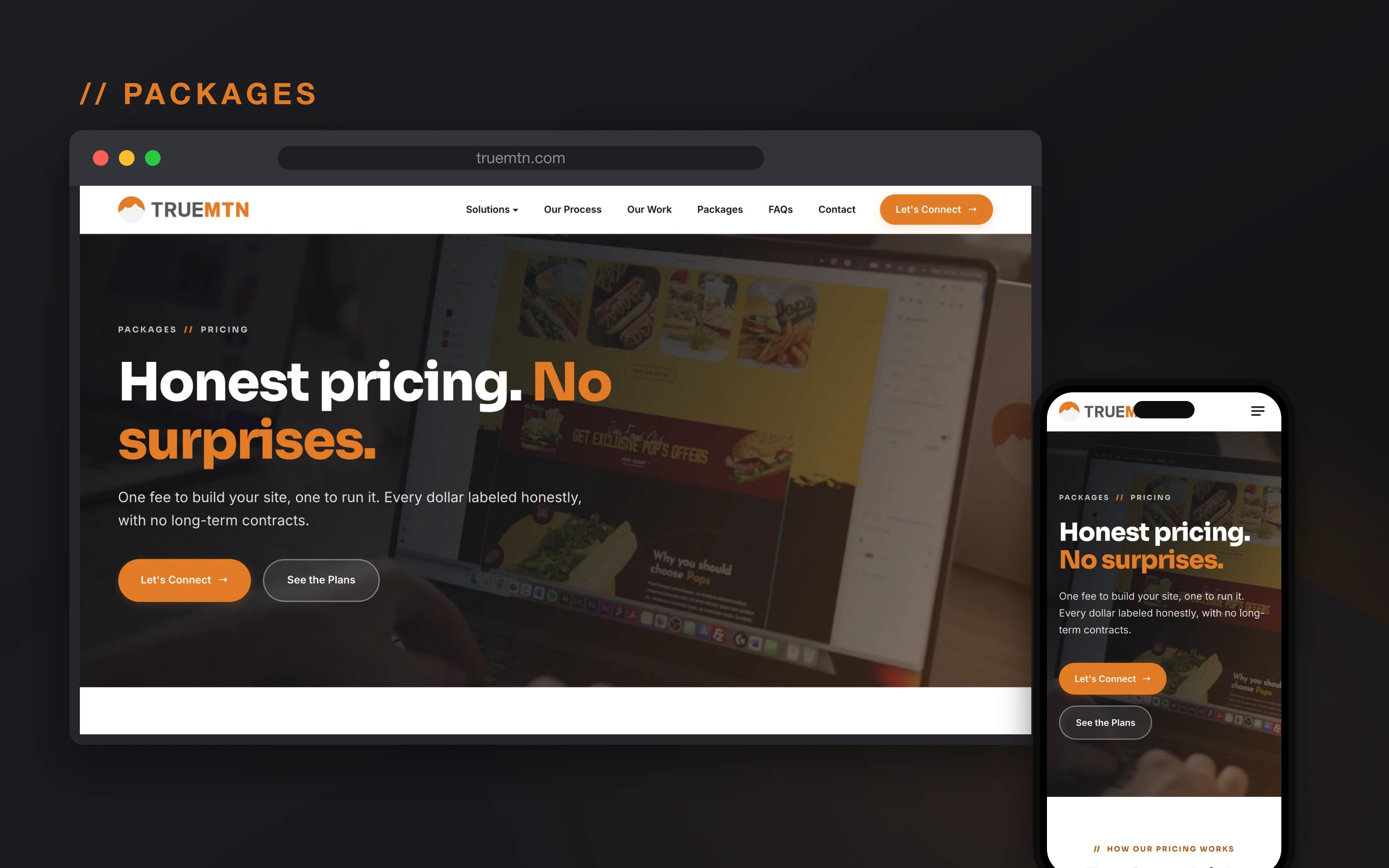
If you want the full story on the new packages, we wrote a whole piece on it: Two Fees, Plainly Named: Introducing the True Mtn 2026 Packages. You can also jump straight to the packages page.
The same eye for craft on every build
This site was designed and built in-house, with the same care we bring to every client project. The platform under a given site is chosen to fit that business and its needs, but the design thinking never changes. Tailored to you, built on our own custom wireframes, and never a bought template.
That is the whole point of rebuilding our own site. It is the clearest example we can give of how we think about design, and what we can do for you.
Take a look
Click around the new site and kick the tires. When you are ready, tell us what you are working on and we will put together a straightforward plan to get you there. Fill out our contact form and let’s talk.